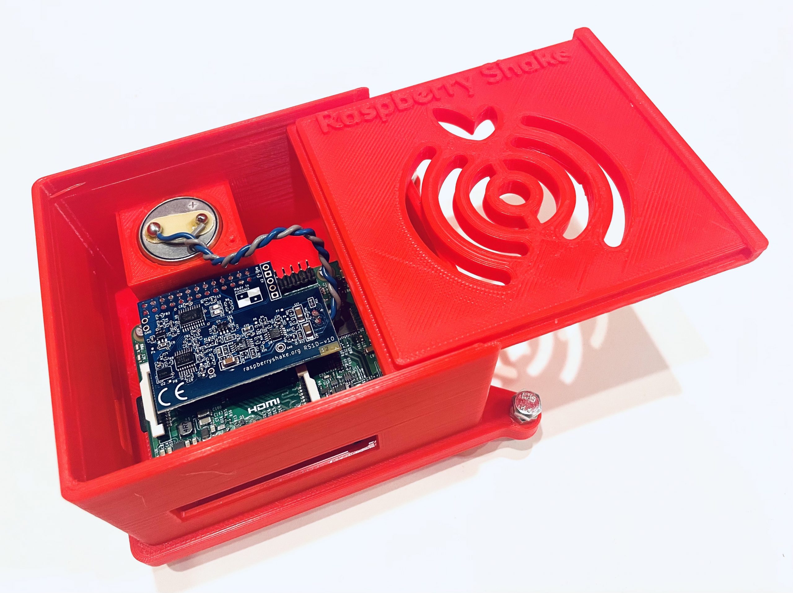
How I Built a 3D Printed Enclosure for My Raspberry Shake
Introduction
My name is Barrett Epp, I am an Art Teacher, tinkerer, builder, and lover of trying new things. I’ve been involved in citizen science projects for a few years now, and I’ve always been interested in using technology to collect data and learn more about the world around me.
I recently built a 3D printed enclosure for my Raspberry Shake, and I wanted to share the details with you to help you create your own. I’ve broken it down into some simple steps, so even if you’re not a 3D printing expert, you should be able to follow along.
I enjoy tinkering with things so even before I purchased my device I got right to work on the enclosure. I looked at the DIY section of the Raspberry Shake website and found the Gitlab link to laser-cut your own acrylic case. For me laser-cutting seemed a little more complex, so I opted to create my own 3D printed case which aligned better with my expertise.
Steps to create your 3D Printed Enclosure
Step 1: Start your 3D design journey with Tinkercad, a user-friendly online program available here. It’s perfect for beginners. While there are more advanced 3D design tools out there, I haven’t explored them myself. If you’re interested in diving deeper, Tinkercad’s website offers numerous project ideas and tutorials. I’ve included detailed instructions, and you can also refer to the accompanying images for additional guidance.
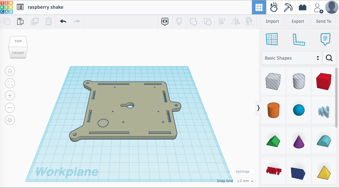
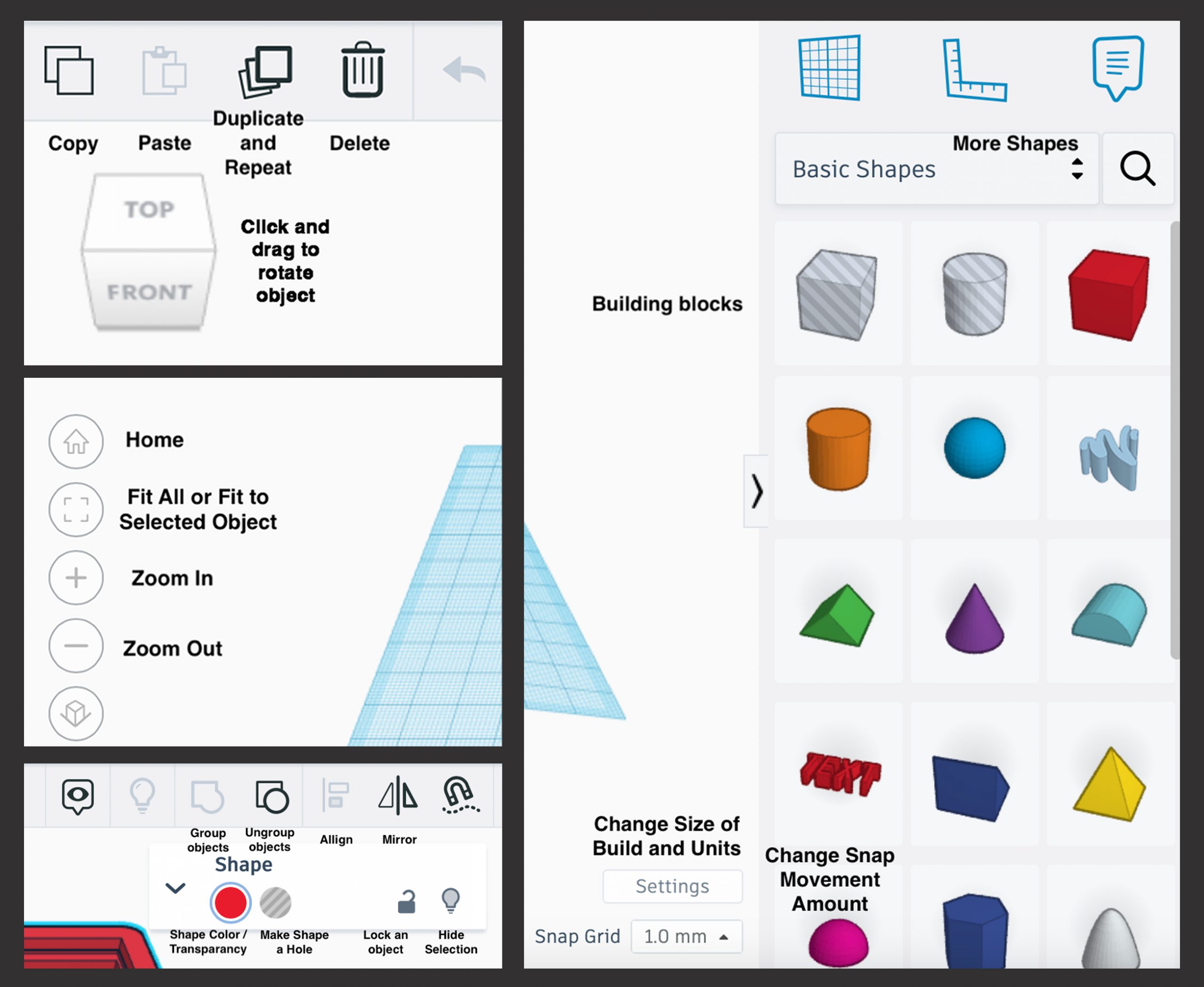
Step 2: To start import the bottom of the Raspberry Shake enclosure from the Gitlab repository by using the import button. The image shows the main Tinkercad screen with the building blocks on the right and controls on the left. I have annotated the following images to explain the program’s tools.
Now import the four side pieces into the design space from the same Gitlab repository and use the tools in Tinkercad to rotate and place them correctly.
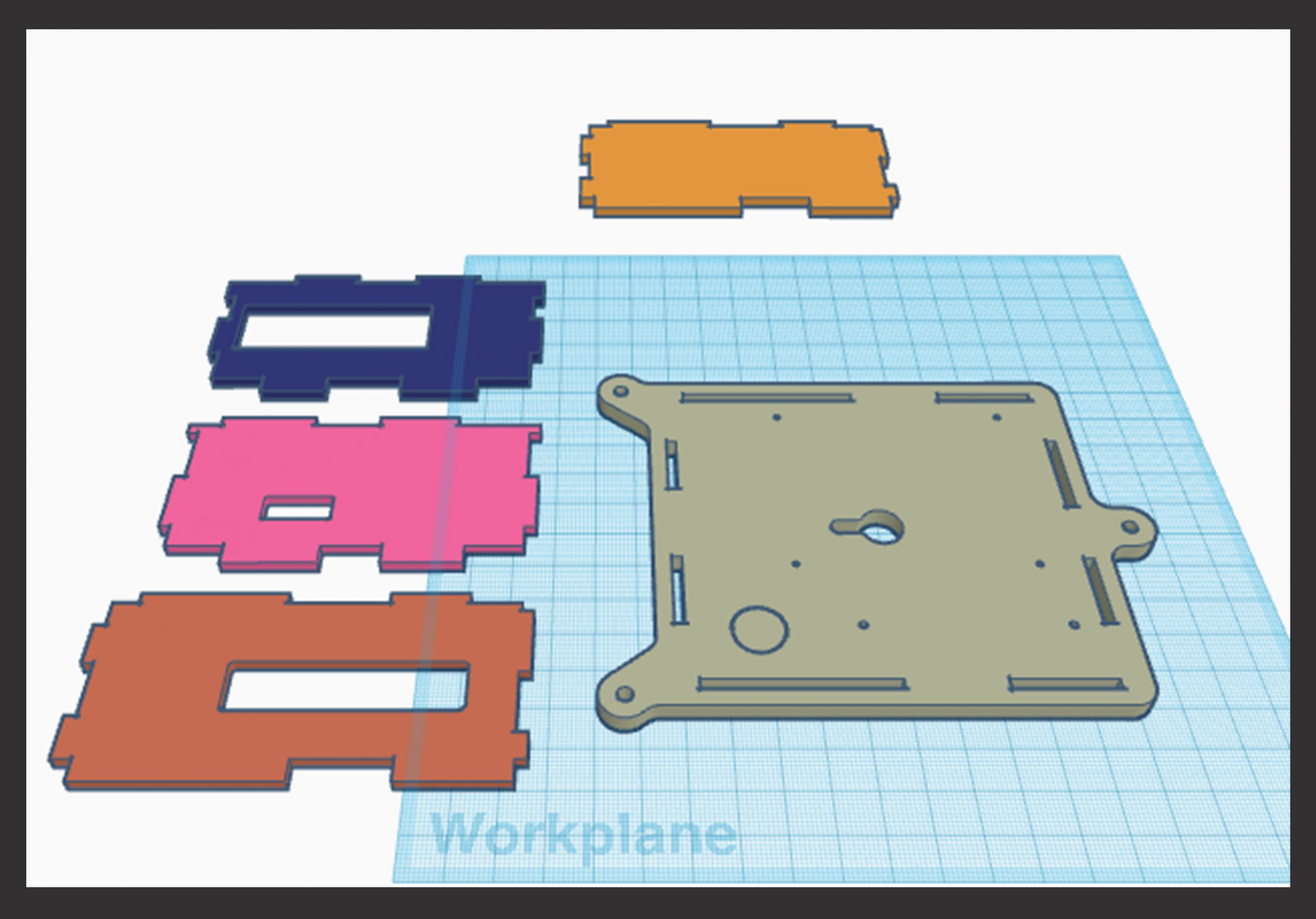
Step 3: Rotate the sides and move them to where they should be using the available tools. This took me a few tries to turn them in the right direction and have them placed in the right spots on the board. I used a photo from Raspberry Shake as a guide to get the pieces in the right place. This view shows some of the tools you use to adjust pieces. The arrows allow you to rotate the pieces, the boxes allow you to adjust the pieces size. The white boxes adjust the object in two directions, the black boxes in one. The cone on the top of your selected piece allows you to move it up and down.
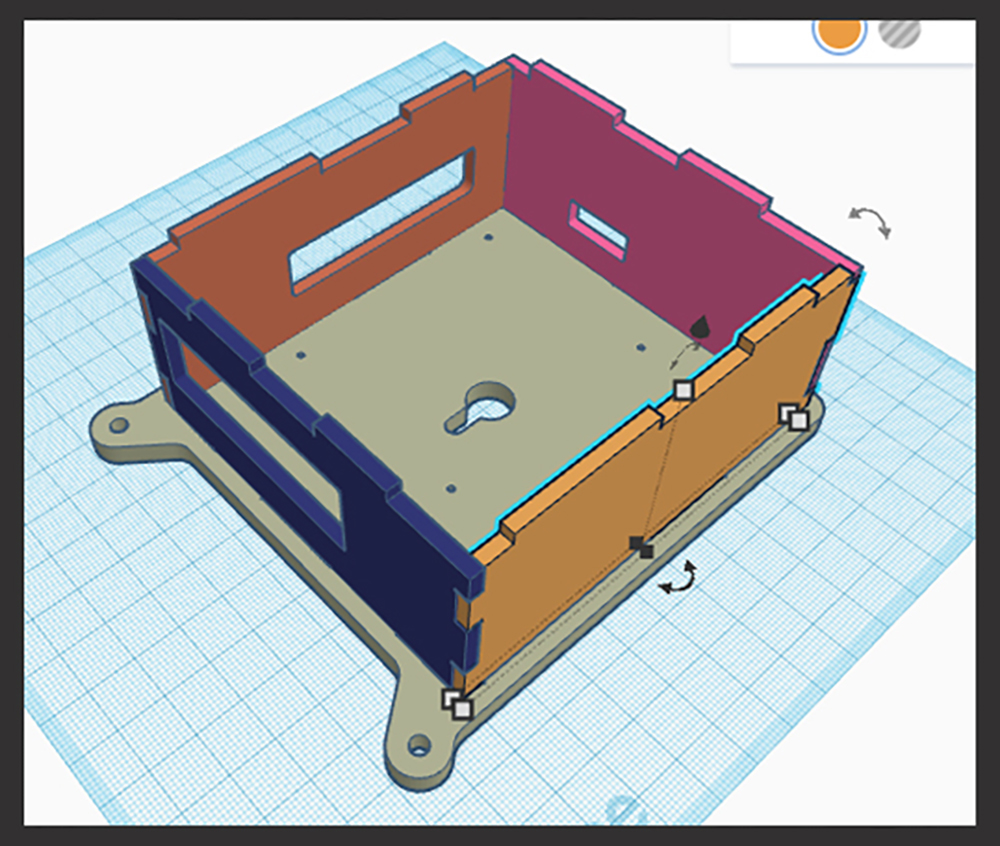
Once I reached this stage, I could have simply aligned everything correctly, combined it into one piece, and proceeded with the printing process. However, a concern arose regarding potential gaps in the bottom or sides of the case. Additionally, using screws in the bottom holes can pose a challenge due to the nature of 3D printing. This is where the real building process begins.
Step 4: Once the basic structure is set, drag a cube from the building blocks on the side and size it to match the needed dimensions, making it slightly taller to allow space for the lid.
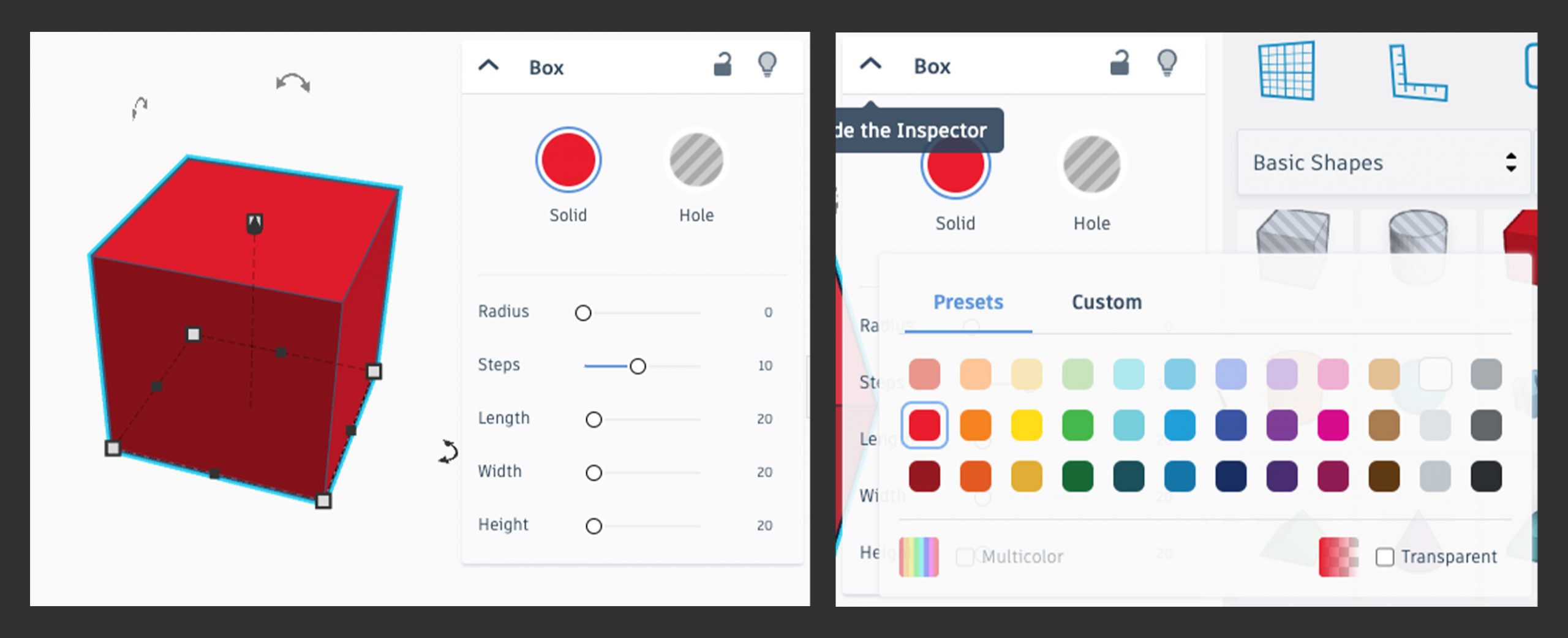
Step 5: Add a radius to the corners of the cube to give it a more polished appearance. The radius command is in the drop-down menu when you select a shape. See picture in step 6.
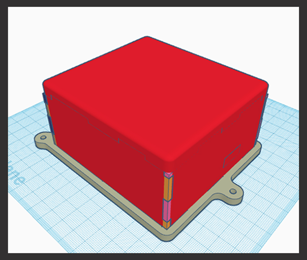
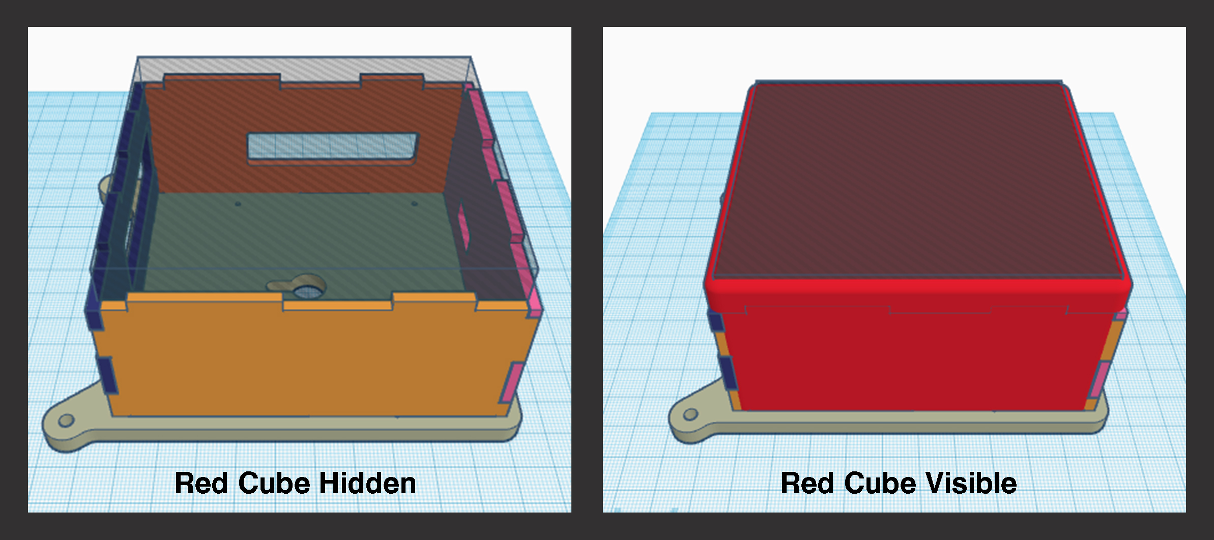
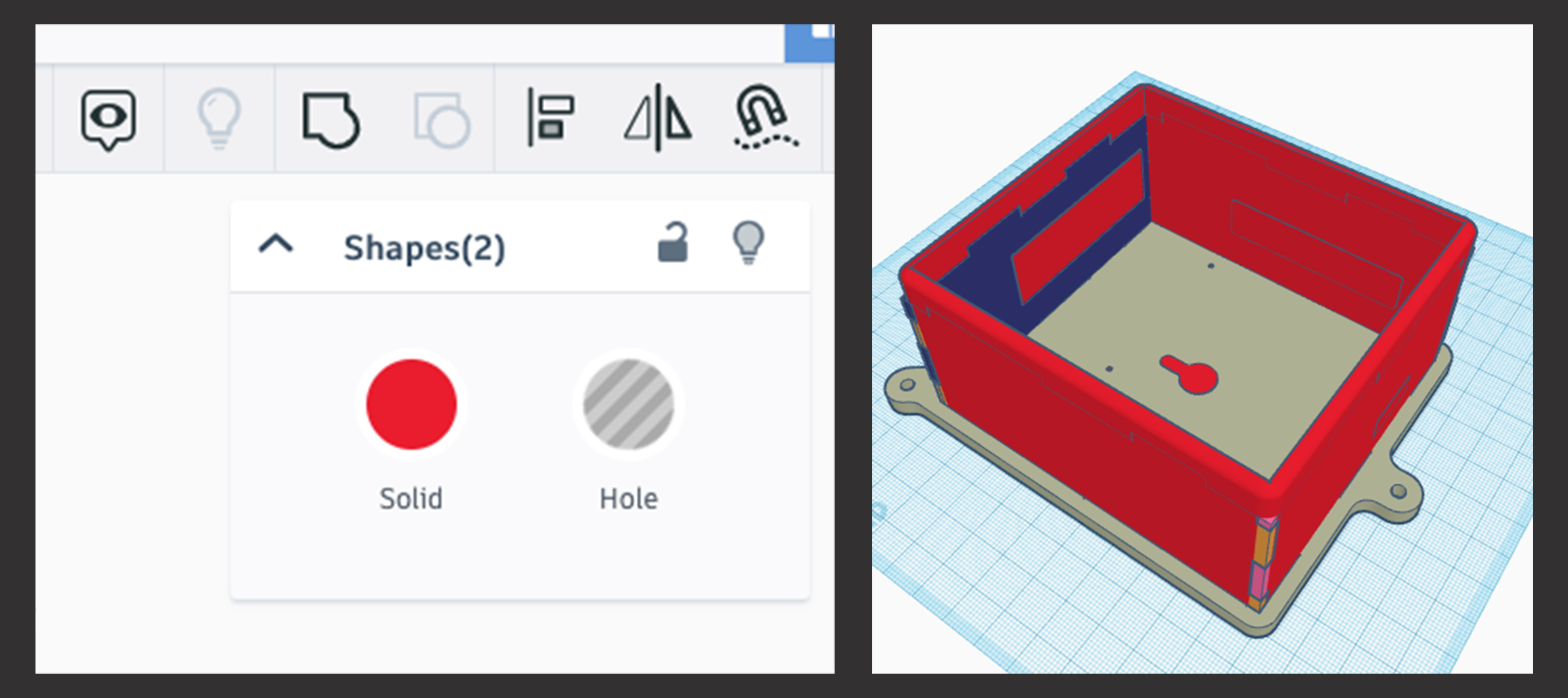
Step 6: Create another box inside the solid cube to make it hollow. Adjust the size of this interior box until it aligns with the original template being used. To achieve a precise fit, you have two options: either change the color of the cube to transparent (semi-transparent), or temporarily hide it while adjusting the size until it seamlessly connects with the original template. This step ensures that the final design remains seamless and functional.
These pictures display the Object Options Panel, which appears when you select or click on an object. Here, you can change an object’s color, turn it into a hole, lock or hide it, and adjust attributes like its radius. Clicking on the color option allows you to make an object transparent (semi-transparent).
I used the lightbulb tool to hide the red cube temporarily, allowing me to align the box shape (which creates a hollow interior) precisely. I positioned the box shape along the inside edges of my template, making sure it would be slightly taller than the red cube when I turned it back on. This ensured that the final design would retain its hollow structure, providing the necessary space for the Raspberry Shake components when printed.
Step 7: Merge shapes together: To do this click on one of the shapes, then hold the Shift key and click on the other shape to select both. The software will display “shapes” followed by the number selected. Next, click on the icon that resembles a square and circle joined together. This step is crucial in the Tinkercad building process as it combines the selected shapes into a unified component, creating a seamless and cohesive design.
At this stage, you should be able to see my original templates still visible on each side of the design. If the original template is not clearly visible, you can use the lightbulb or transparency function to reveal where the ports on the side should be positioned. This ensures that the final design maintains alignment with the initial templates, resulting in a well-organized and functional 3D printed case.
Step 8: To create the openings for your enclosure, start by dragging another cube shape from the sidebar into your design. Use the available tools, move and resize this cube, ensuring it matches the size of one of the holes in the template. Once properly sized, group this cube with your red cube to create the desired opening. Repeat this process for all the other openings you need in the design. By following these steps, you can seamlessly integrate the necessary openings into your 3D printed case, making it fully functional and ready for use.
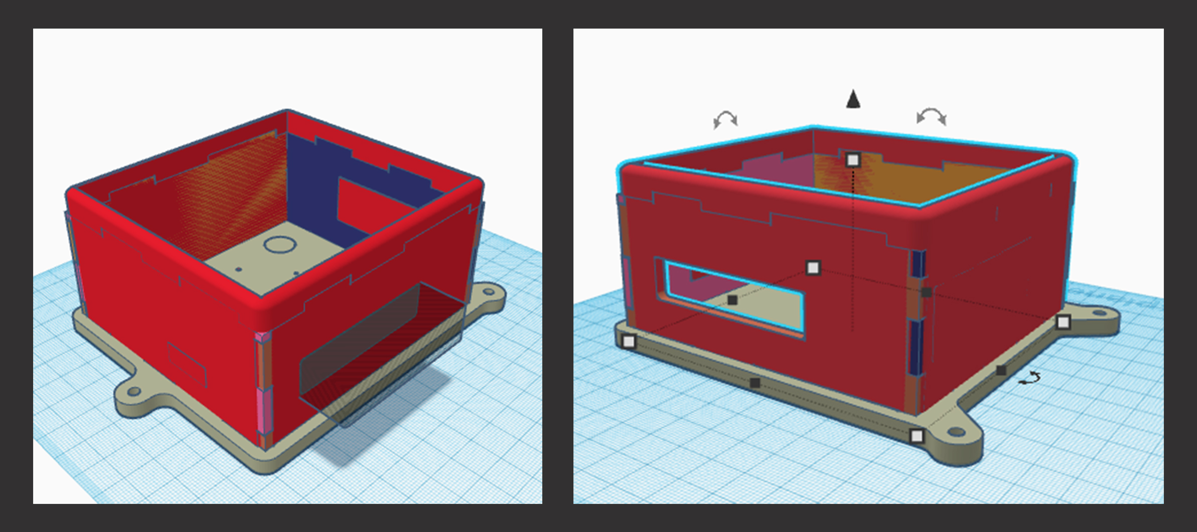
Now, let’s focus on refining some of the finer details. This is where you can make subtle changes to tailor the design to your specific needs. Personally, I created numerous iterations even before having the Raspberry Shake to check the fit.
In my initial design, I used threaded inserts and screws to secure the lid, but I found the assembly process unsatisfying. I also had to make adjustments to the geophone’s precise placement and the design of the board standoffs. To avoid the need to order metal standoffs separately, I decided to incorporate them directly into the print.
Of course, depending on the hardware you plan to use for securing the Raspberry Pi, you may need to adapt some of these aspects. Nevertheless, I will guide you through the essential steps that form the basis of the design refinements.
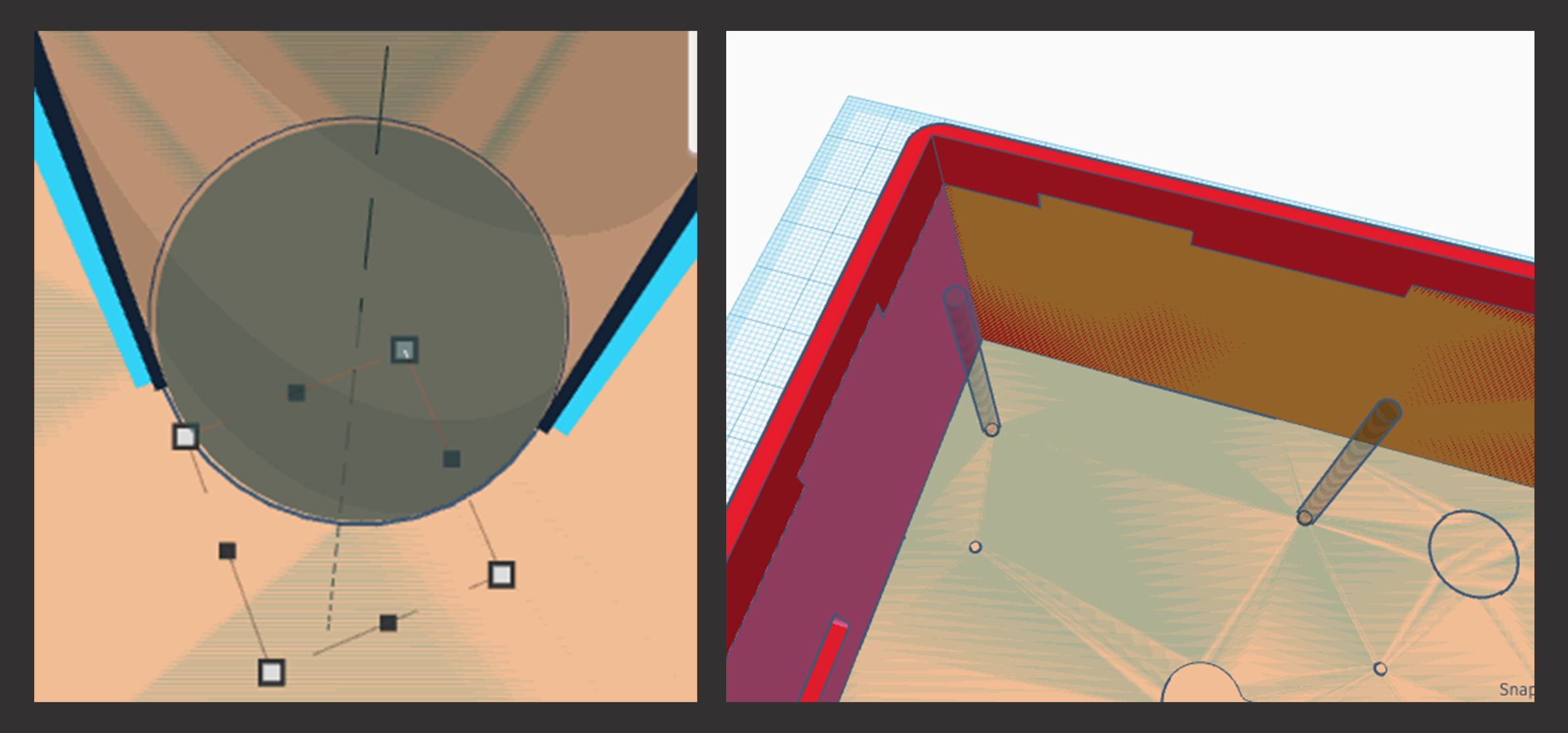
Step 9: Design the openings for the geophone and Raspberry Pi mounts by dropping cylinder hole shapes into the design space. Positioning them over the original holes in the bottom plate template. Duplicate and move the shapes to create all the necessary holes for mounting points (my picture does not have all the holes added yet). Adjust their size and position as needed. The holes to mount the geophone need to be tall. Be as precise as possible, otherwise the holes will not line up with the raspberry pi. You can see how close I was with this hole. You may have to change the snap grid unit to get a close line up. This can be found on the bottom right of the main screen.
Step 10: To add the geophone mounting block create a cube that is slightly wider than the geophone and long enough to encompass the mounting points. Add a cylinder hole in the cube to securely hold the geophone in place. Ensure a precise fit by researching the geophone dimensions and making necessary adjustments. Achieving a precise fit is crucial, and it might take a few attempts to get it right due to variations among printers. Consider including a small hole from the outside of the block into the geophone cavity to prevent vacuum formation.
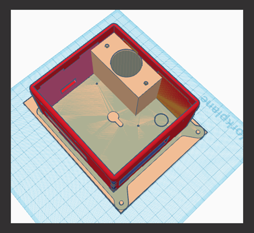
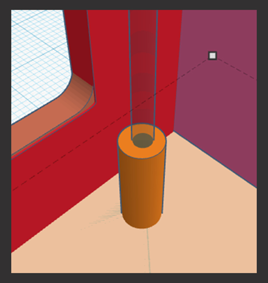
Step 11: For the Raspberry Pi standoffs, make cylinders around the holes to support the board. The height of the cylinders will depend on the Raspberry Pi’s placement. I used the same height that the metal standoffs would be. Those can be found in the Gitlab repository under the readme section.
Step 12: Review and refine the design, making any subtle changes to suit your preferences and hardware requirements.
Consider the type of lid you desire for the case, whether it’s a sliding track or a screw-down lid. Customize it to your preference. The rest of this tutorial will show how to make a simple sliding lid.
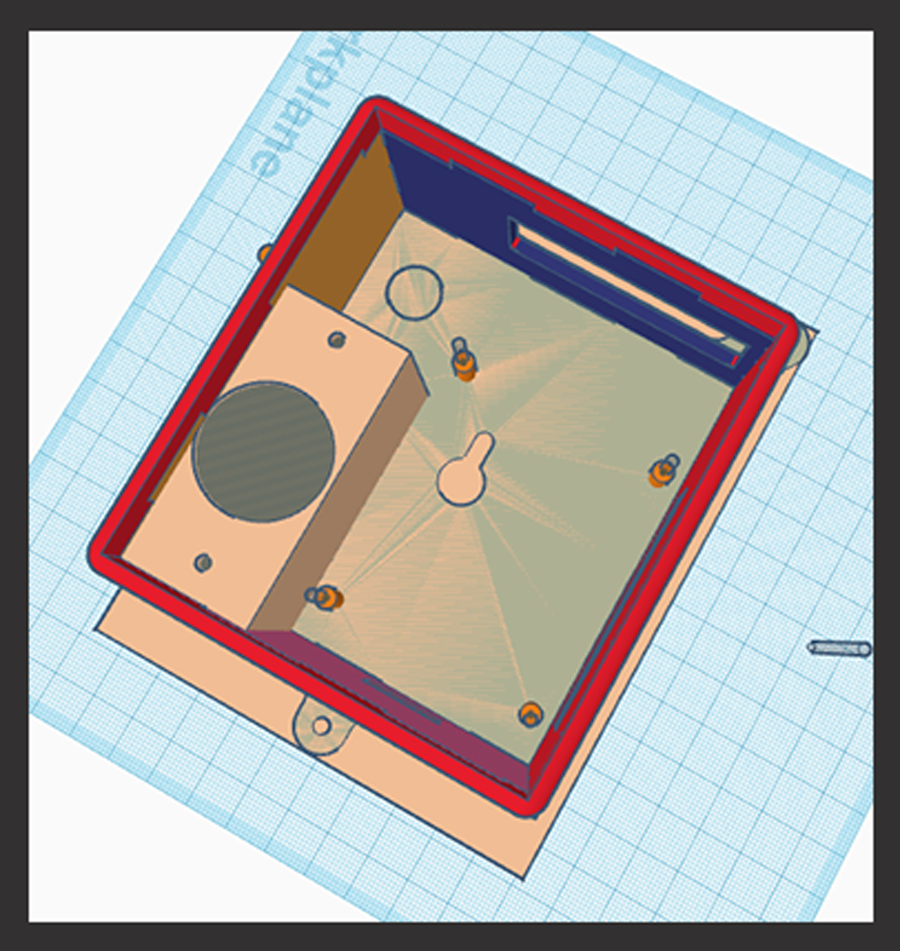
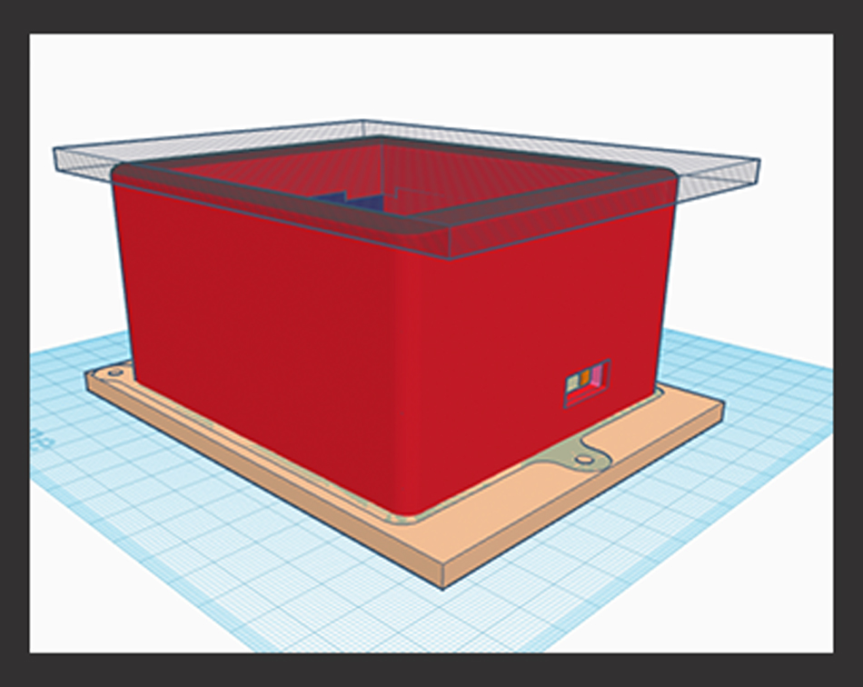
Step 13: To create a sliding lid, increase the height and thickness of the design while ensuring the inner dimensions remain unchanged. Before making any adjustments, ungroup the box from the openings to avoid unintentional resizing of any openings.
Step 14: Once the design is modified, use a “hole” shape to remove the top of the box. This simplifies the lid design by eliminating the need to deal with rounded corners.
Step 15: Group your shape to your original design.
Step 16: Now create a “hole” shape slightly smaller than the outside of your case with one side going to the edge. Place it on top of the shape to ensure the correct dimensions. This will serve as the track for your sliding lid.
Step 17: Now add a rectangle to act as the handle to pull open your lid. For my design, I made the handle the same length and thickness as the end of my case.
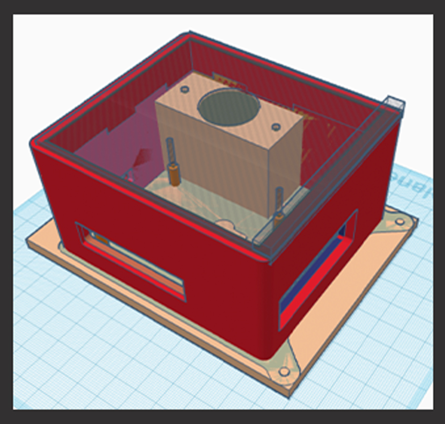
Step 18: After shaping it correctly, group your shape, and then duplicate it (using the stacked paper command).
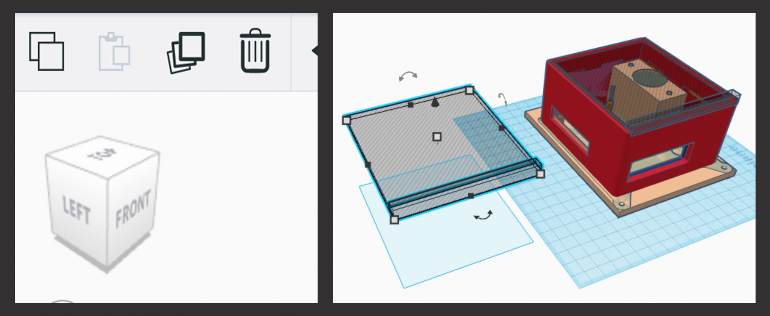
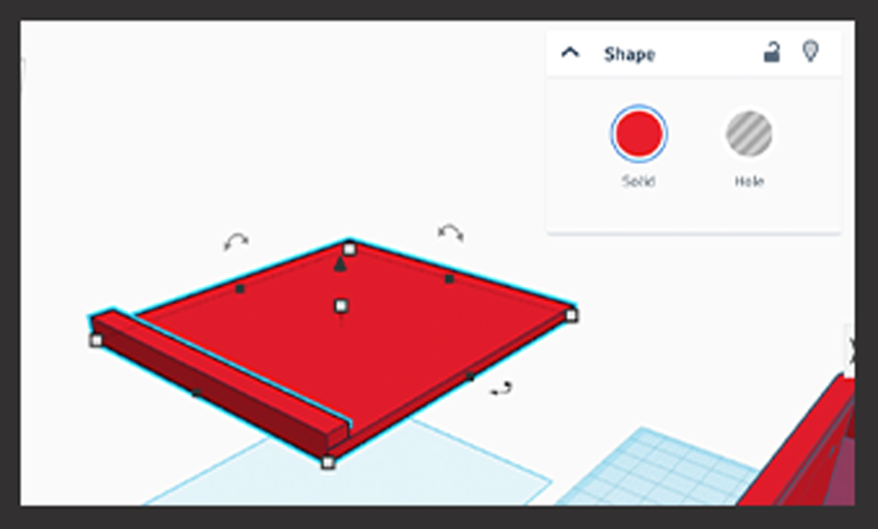
Step 19: Once duplicated, switch the duplicated shape from being a hole to a solid shape. To do this, select your shape and click on “solid” instead of “hole.”
Step 20: Slightly adjust the size of this shape so that it will easily slide in and out of the track. Modify all three dimensions – length, width, and height to make it slightly smaller
Step 21: Move the hole shape down into your design to create a track for the lid to slide into. Click on your shape and use the cone shape to move it downward.
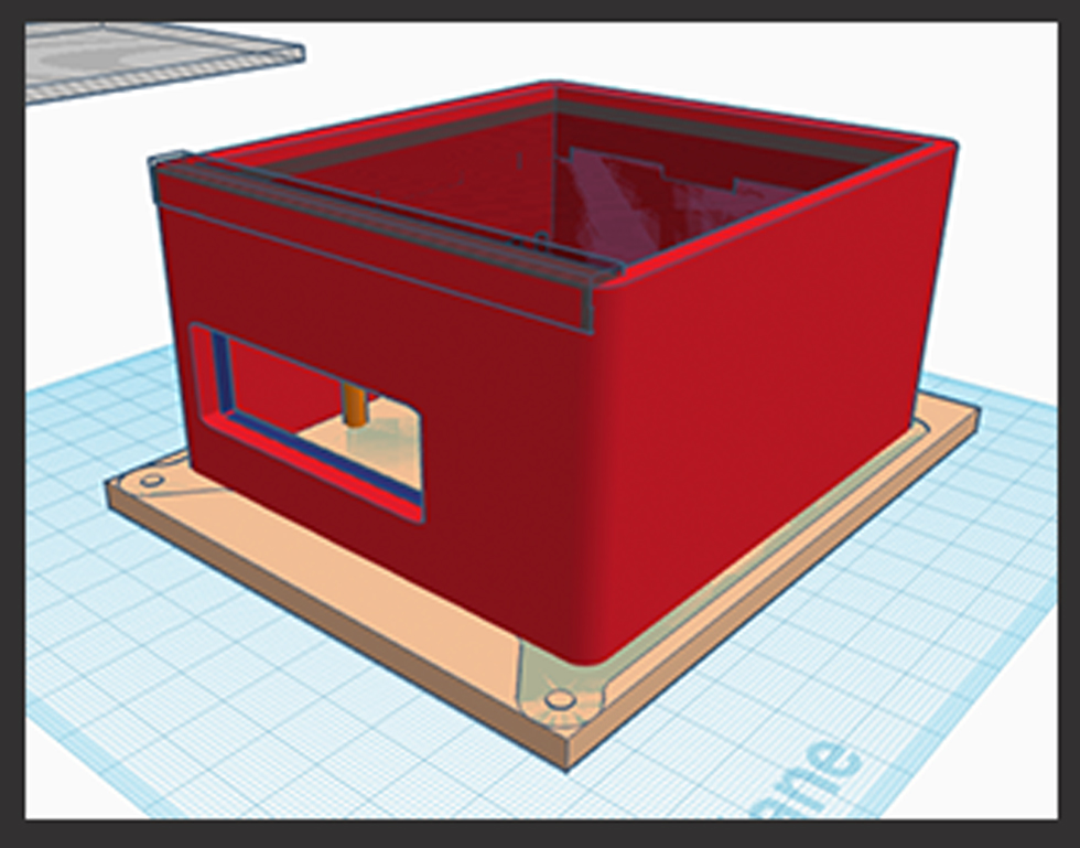
Step 21: Move the hole shape down into your design to create a track for the lid to slide into. Click on your shape and use the cone shape to move it downward.
Step 22: Combine your lid “hole” shape into your design by selecting both shapes and using the combine tool.
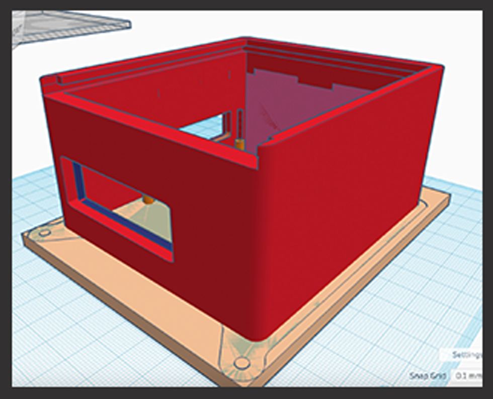
In my final design, I made a number of changes. I spent more time refining the bottom plate’s appearance. Half way through this tutorial I added a separate base that was to fill some of the extra holes and gaps, which is optional. The tapered stand-off pegs offer better support, avoiding breakage during assembly attempts.
To simplify assembly, I added a hexagon recess for placing nuts, providing flexibility in bolt length and enabling top insertion. While not my ideal solution, it worked well. I hope you can devise an even better approach for your design. I also added the top raspberry shake logo in order to add ventilation.
Step 23: Once you are satisfied with your design, delete the original templates. I kept the bottom template but removed the sides. Then combine all the components into one piece.
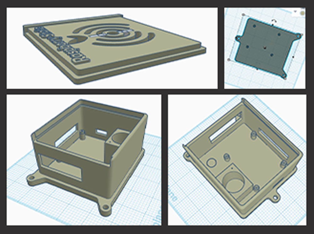
Step 24: Preview the final design to ensure everything is in place, and there are no errors.
Step 25: Finally, 3D print the case to bring your design to life.
Note: Throughout the process, expect some trial and error, especially regarding fit and compatibility with your specific 3D printer. Make adjustments as needed to achieve the desired result.
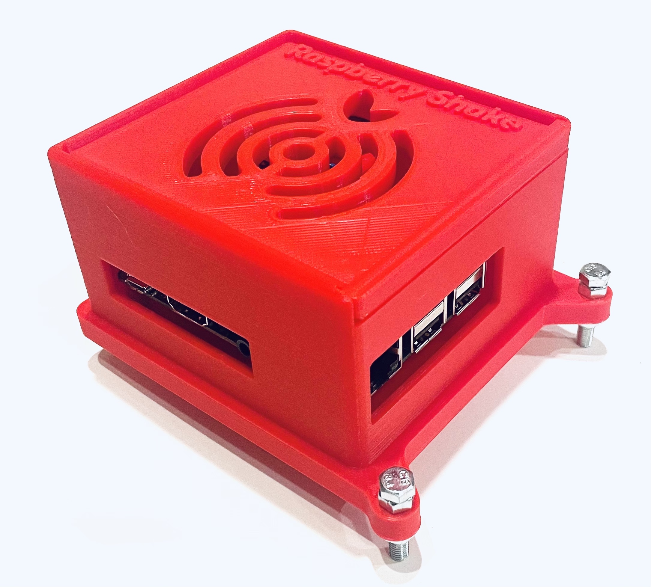
My Raspberry Shake is currently installed in my detached garage, resting on a set of sturdy bricks. You can observe its activity and vibrations by visiting StationView here.
I hope my experiences inspire you with new ideas and different ways to explore the possibilities with your Raspberry Shake. May these insights lead you to find unique ways to contribute to the greater good around you. Happy experimenting!
